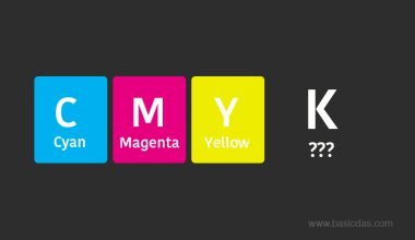
Back when I was in college, fonts were just variations like Arial, Helvetica, or Times Roman. Serif and Sans Serif were alien terms for me. It wasn’t until I started working that I realised how important typography is. I learned two key things:
- Typefaces and Fonts are different: A typeface is a a design of letters, numbers and other symbols. And fonts are variations within a typeface, like italic or bold. For example, Roboto is a typeface. Roboto thin, Roboto light, Roboto regular are fonts.

- Serif and Sans Serif: These are the main types of typefaces every designer needs to understand.
Understanding Serif and Sans Serif
While there are numerous categories of typefaces, these two are the ones we encounter most frequently. Identifying the difference between them is quite simple. Below, you’ll see our logo in both categories.

See the difference? Serif fonts have an extra stroke or decorative design at the end of letters, whereas Sans-Serif doesn’t have any such design or stroke. Take a look at the image below.

Serif stands for a stroke or line, while ‘sans’ means ‘without’. Therefore, a sans serif typeface refers to a typeface without strokes or lines. Simple, isn’t it?
Exploring Serif and Sans Serif Fonts
Serif fonts are commonly used in print media like books and newspapers for improved readability. However, Sans Serif fonts are more modern and popular in digital formats like websites and software interfaces. However, it’s essential to note that this isn’t a strict rule. You have the freedom to explore and unleash your creativity..
The choice between these two fonts depends on personal preference and project requirements. Whether you prefer serif fonts for traditional designs or sans serif fonts for modern layouts, the decision is yours.
What’s your preference? Share in the comments below.
Like with these fonts, JPG and JPEG are often confused, as are Opacity and Fill in Photoshop. To read about it, click on the links.
Frequently Asked Questions
What are Serif and Sans Serif fonts?
They are types of typefaces. Serif fonts have decorative strokes or lines at the ends of letters, while Sans Serif fonts do not.
Can Serif and Sans Serif fonts be used together?
Yes, many designers use a combination of both fonts within a project to create visual interest and hierarchy.
Why are Serif fonts considered more readable in print?
Because they are believed to improve readability in print due to the added strokes, which help guide the reader’s eye along the text.
How do Serif and Sans Serif fonts impact brand identity?
Both fonts can convey different brand personalities. Serif fonts may evoke tradition and reliability, while Sans Serif fonts offer a modern and clean aesthetic. For in-depth information on branding and real-life examples of both fonts usage, you can explore this insightful article by the Canva team.
Are there other types of typefaces?
Yes. Additional types include Display, Script, Monospaced, and Decorative.


